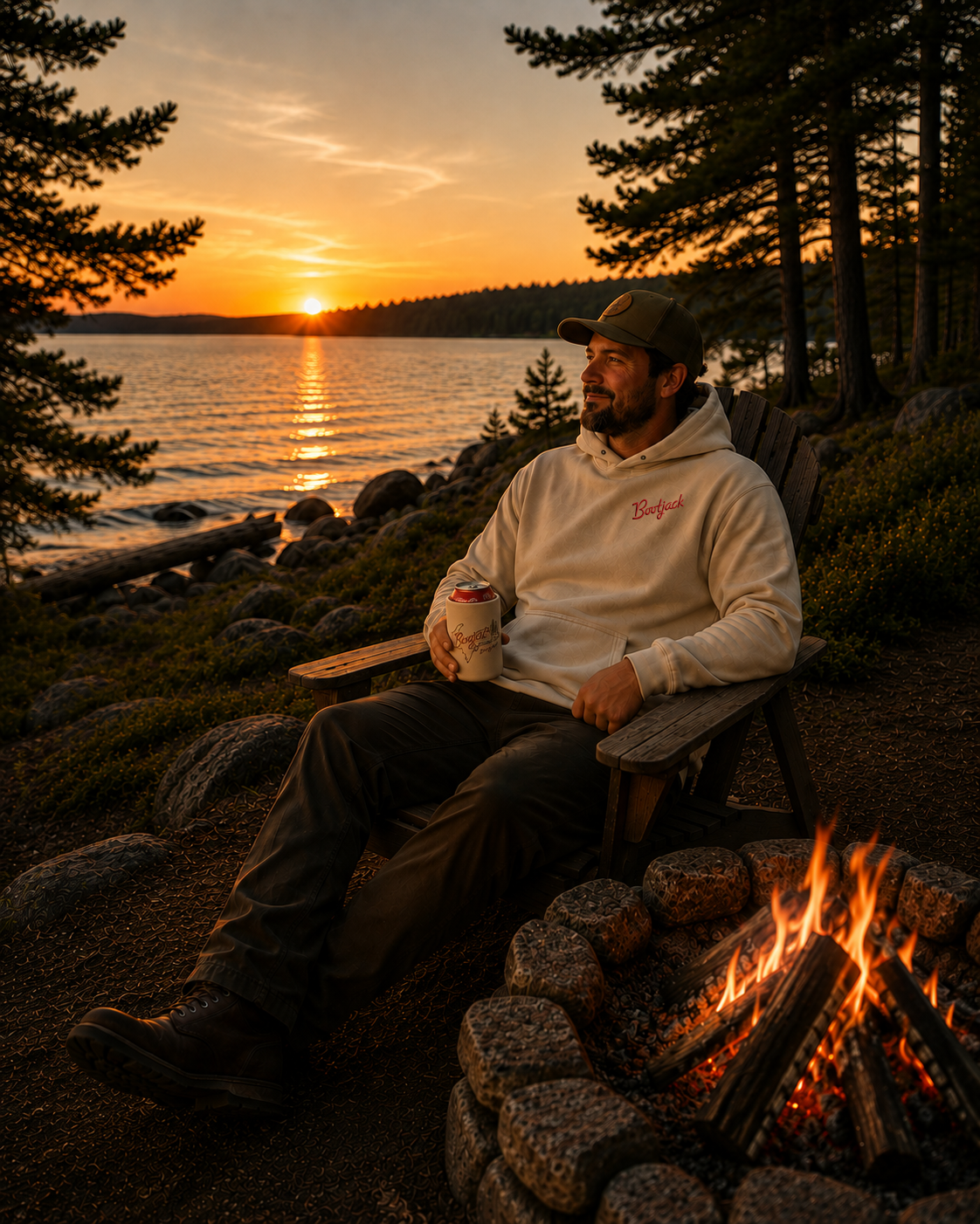
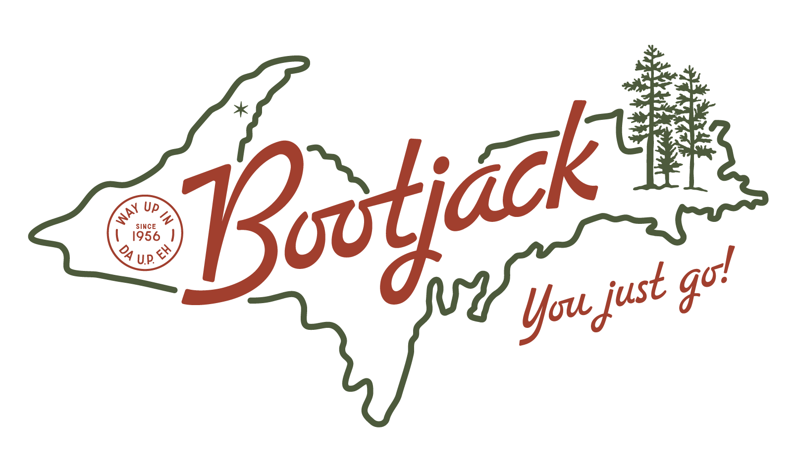
Bootjack is a lakeside cabin brand inspired by the nostalgic spirit of 1970s outdoor graphics and the laid-back aesthetic of summers spent on the water. Designed for a family retreat in Northern Michigan, the identity celebrates generations of memories made at the cabin since 1956, drawing from vintage camp graphics, heritage outdoor branding, and classic lake culture. At Bootjack, time seems to cease to exist—there are no strict plans or set meeting times; you just go. That easygoing rhythm of lake life is at the heart of the brand, creating a timeless, approachable identity that honors Bootjack’s history and the traditions that continue to bring the family back year after year.
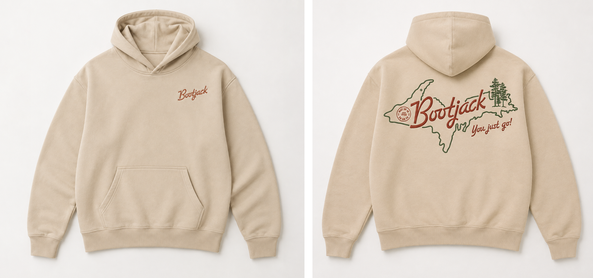
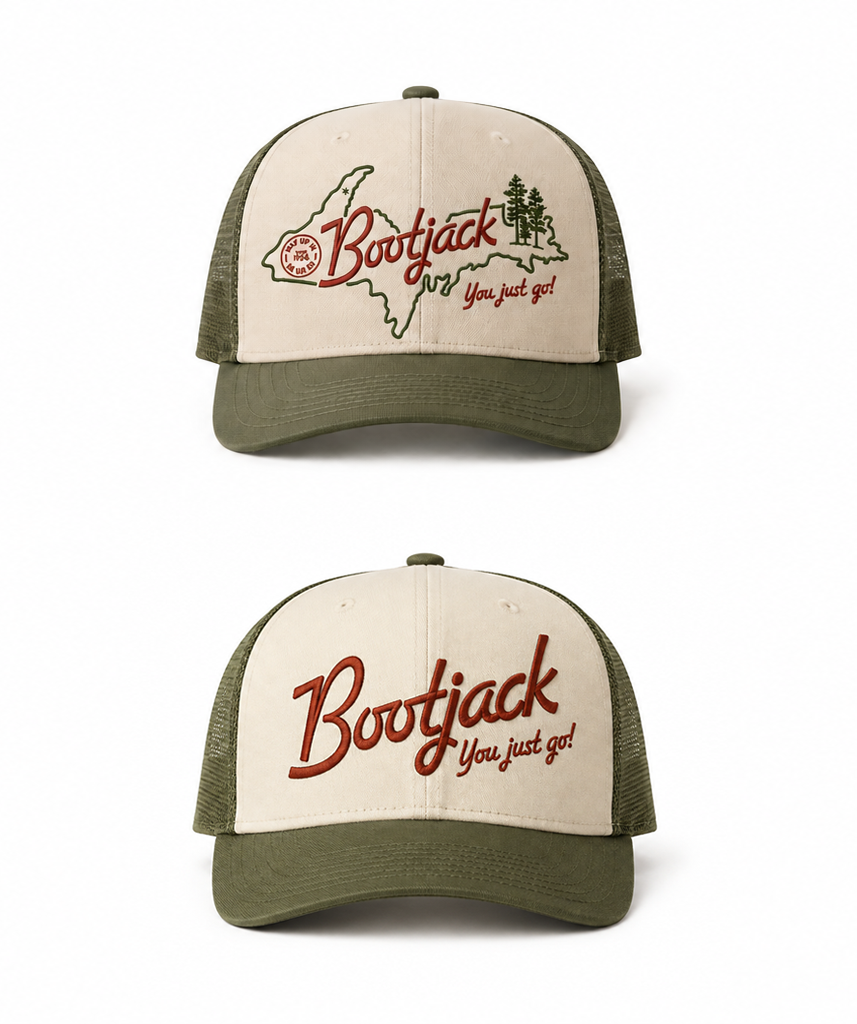
Brand applications included embroideries on the front and back of hoodies, embroidered on trucker hats, and screen printed on koozies. All staples for lake life.
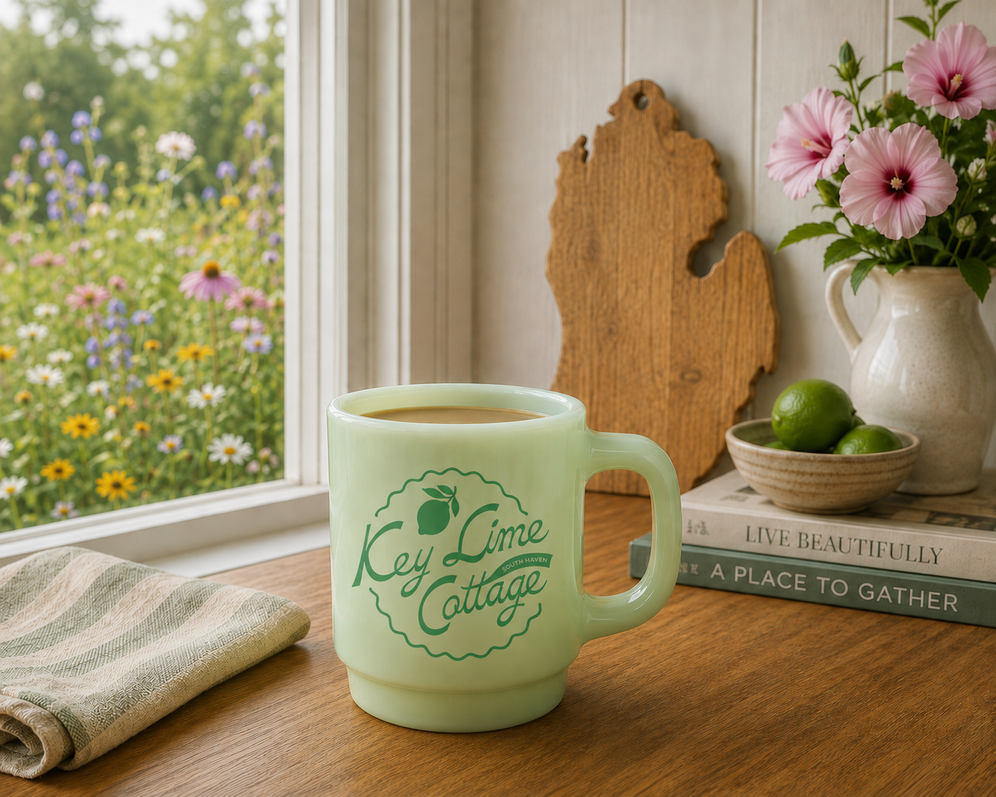
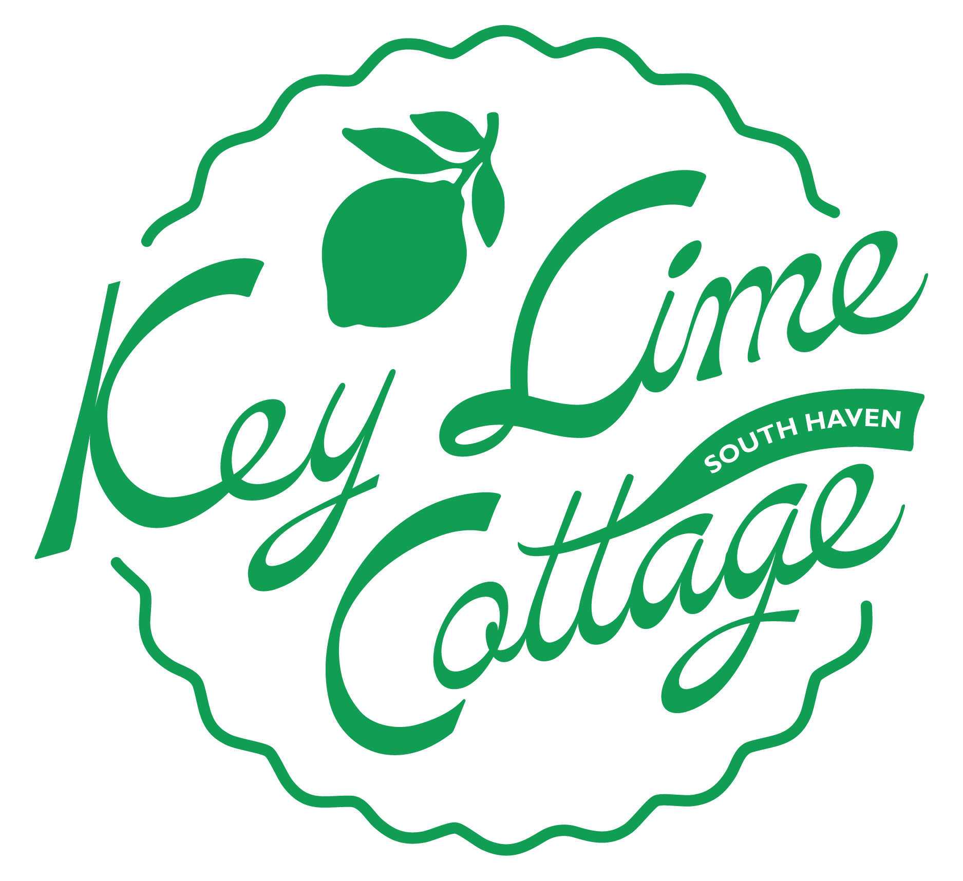
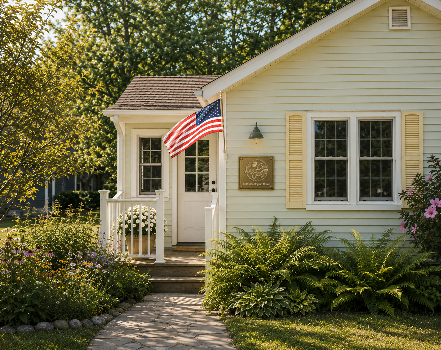
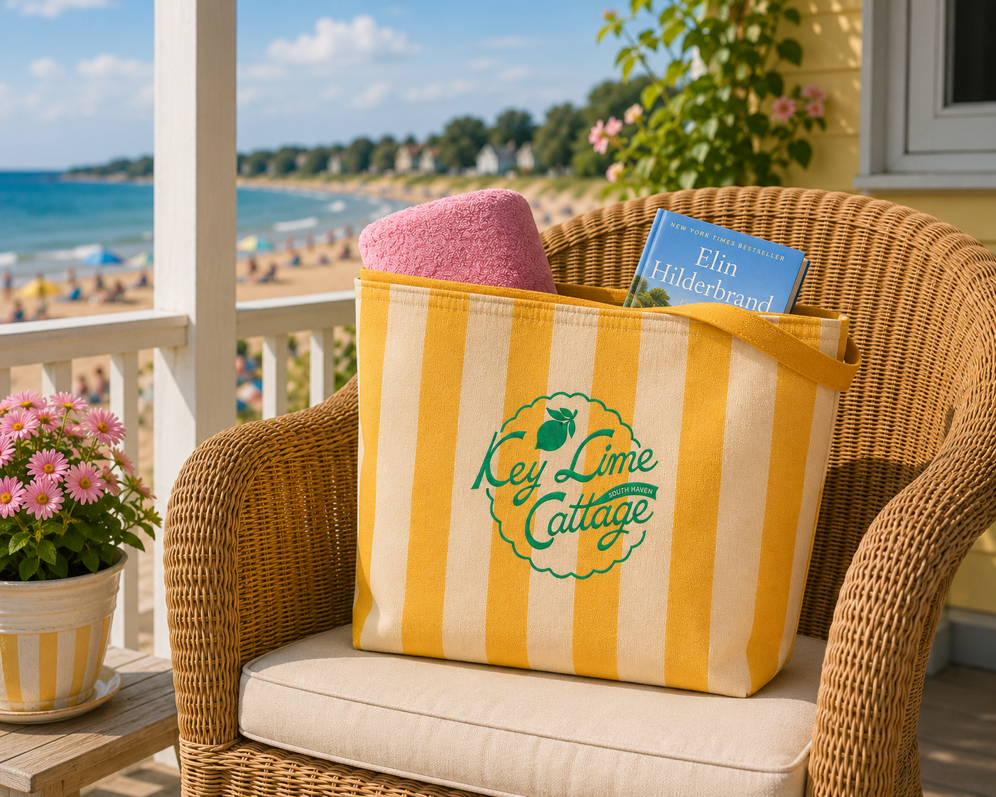
Key Lime Cottage is a family lakeside retreat in South Haven, Michigan, where generations have gathered since the early 1980s. More than just a cottage, it represents the magic of summers spent together—full of laughter, creativity, family traditions, and plenty of crafts made around the table.
The brand draws inspiration from the family’s beloved local ice cream shop and the nostalgic charm of classic lake-town merchandise. Playful, colorful, and a little retro, the identity captures the carefree spirit of cottage life while celebrating a place that has become an enduring backdrop for decades of family memories.
Brand applications included embroidery on canvas beach bags, printed on jade, milk glass coffee mugs and a brass plaque for the house.
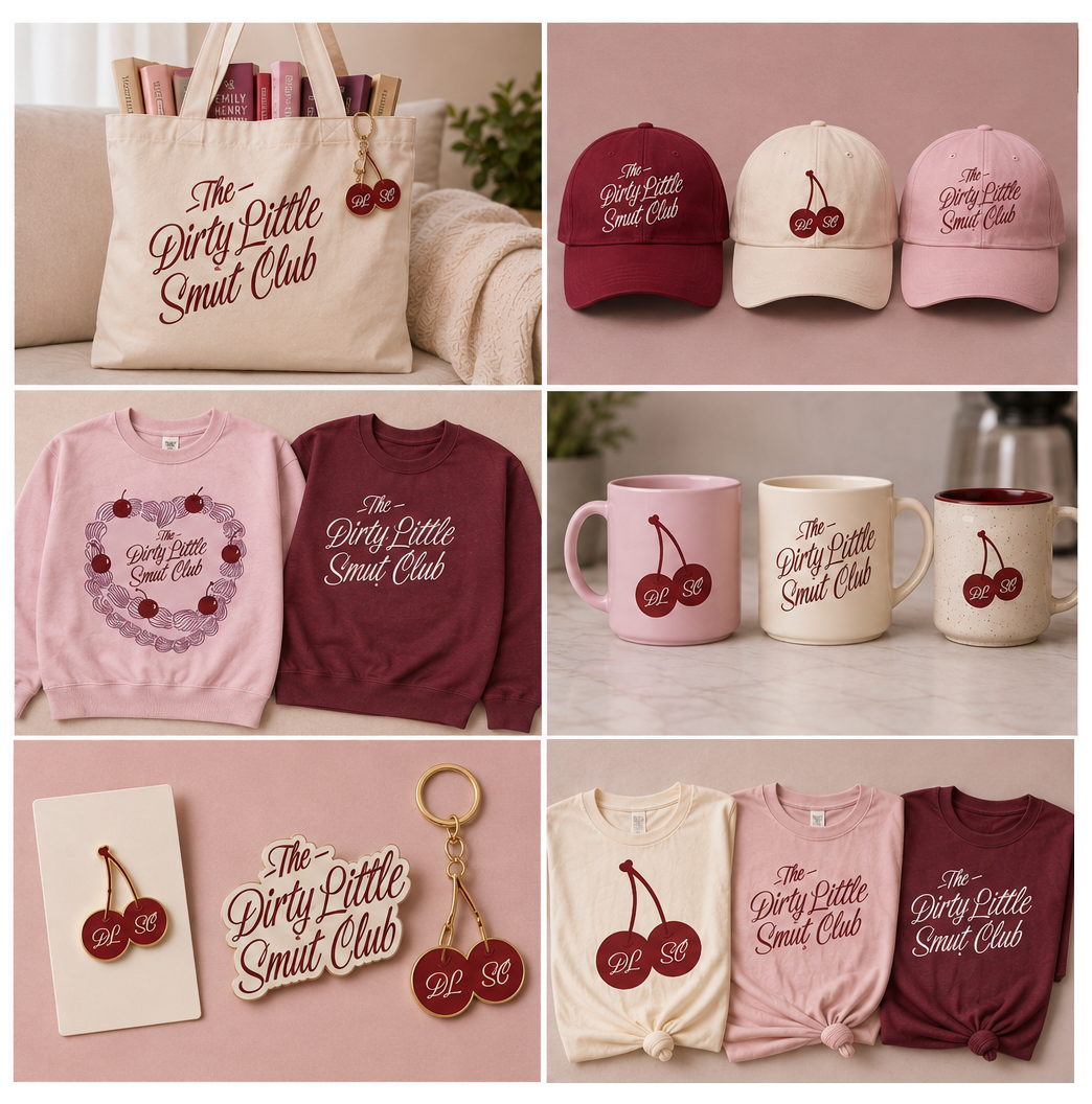
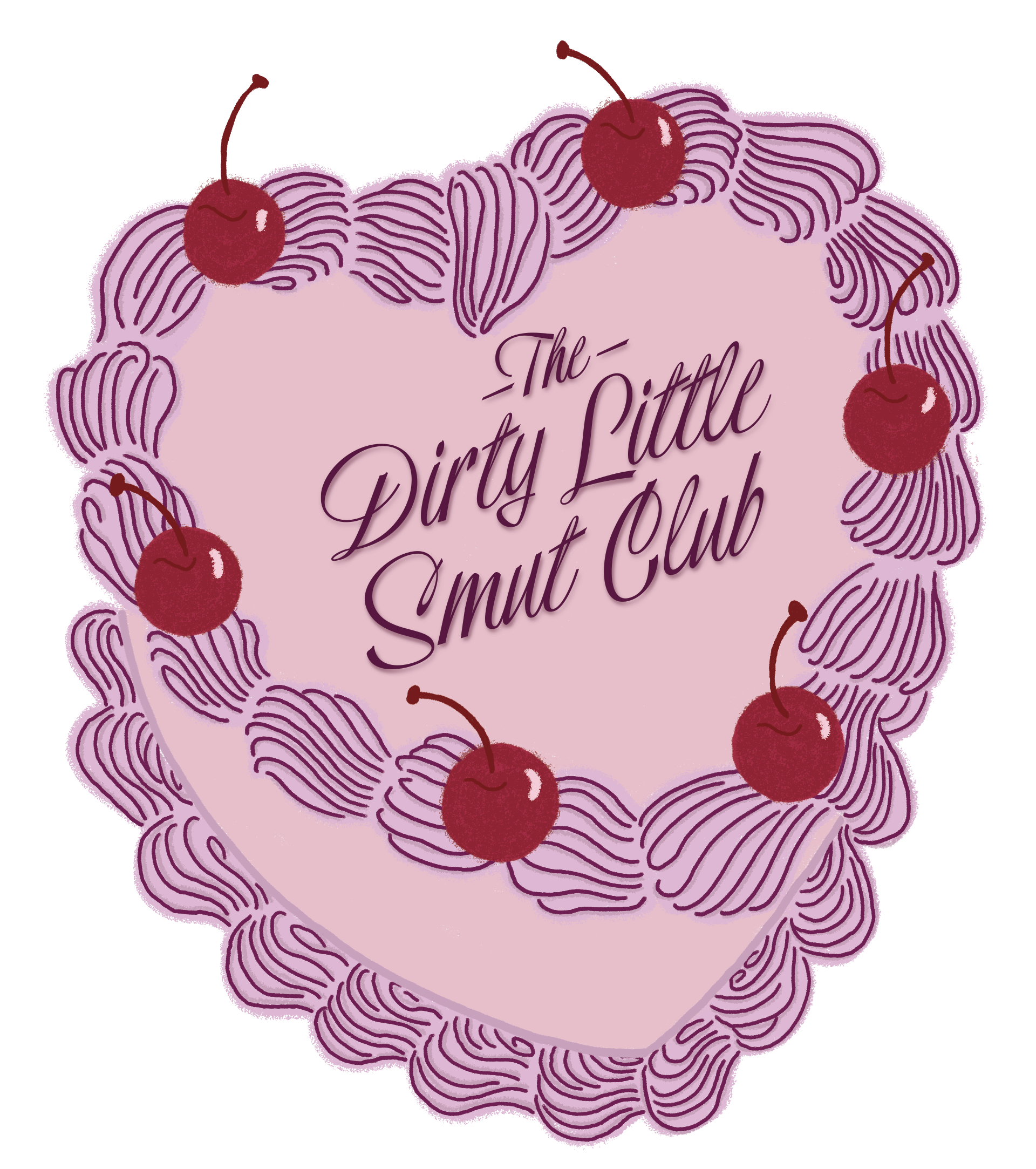
The Dirty Little Smut Club is a playful, romance-fueled identity created for a group of women in Seattle brought together by their shared love of a good love story. Reading exclusively romance novels, the club embraces everything swoony, steamy, and a little cheeky—with a name inspired by the cake that helped kick it all off.
The branding blends retro-inspired design with the nostalgic romance of vintage book covers and a touch of sweet indulgence. The heart-shaped cake serves as the primary logo, bringing the club’s origin story to life, while cherries and rich shades of plum, red, and blush give the identity a flirtatious, feminine feel. The result is a brand that feels equal parts romantic, playful, and nostalgic—a celebration of friendship, books, and stories with a little spice.
Kids 2 Tradeshow Booth Design
Project Overview:
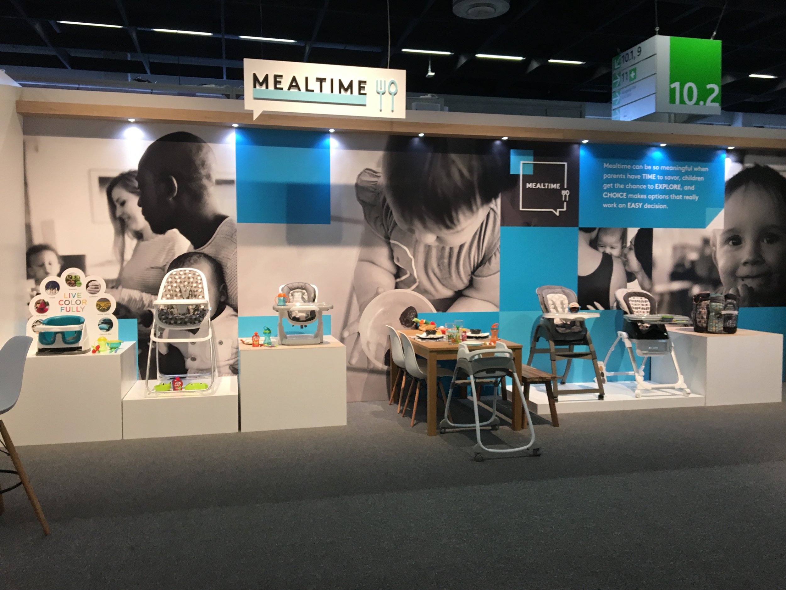
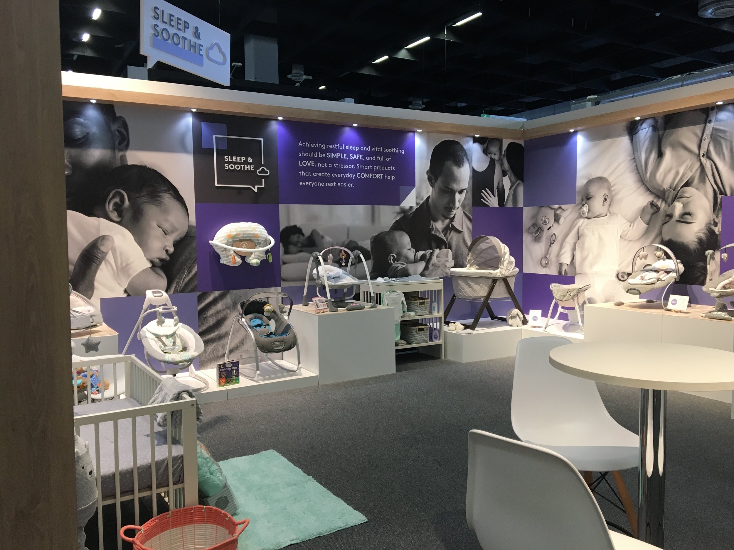
Design a bright, dynamic tradeshow booth centered on the theme “Tiny Wins Create Bright Futures.” The booth should highlight the company's four product categories in a visually engaging way.
Project Deliverables:
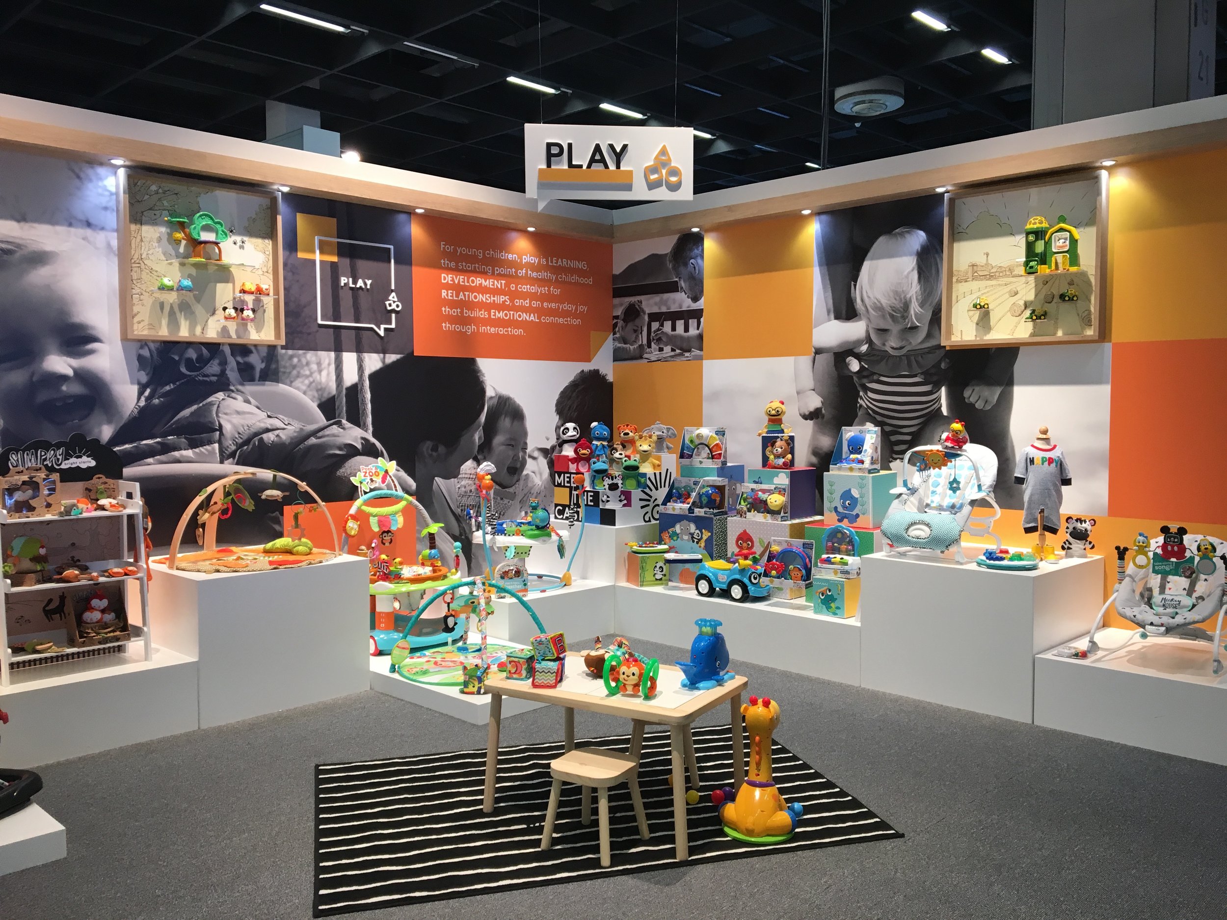
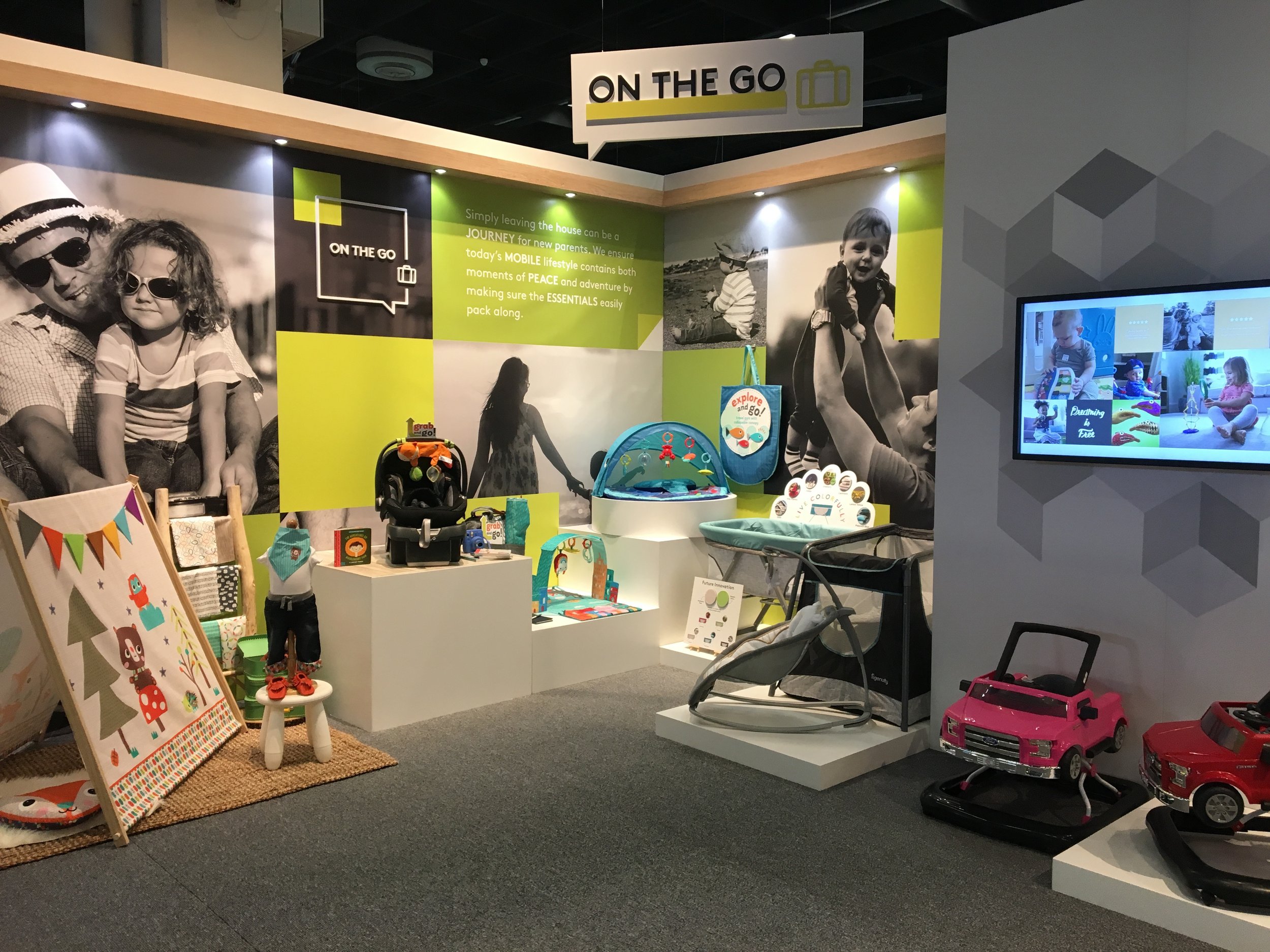
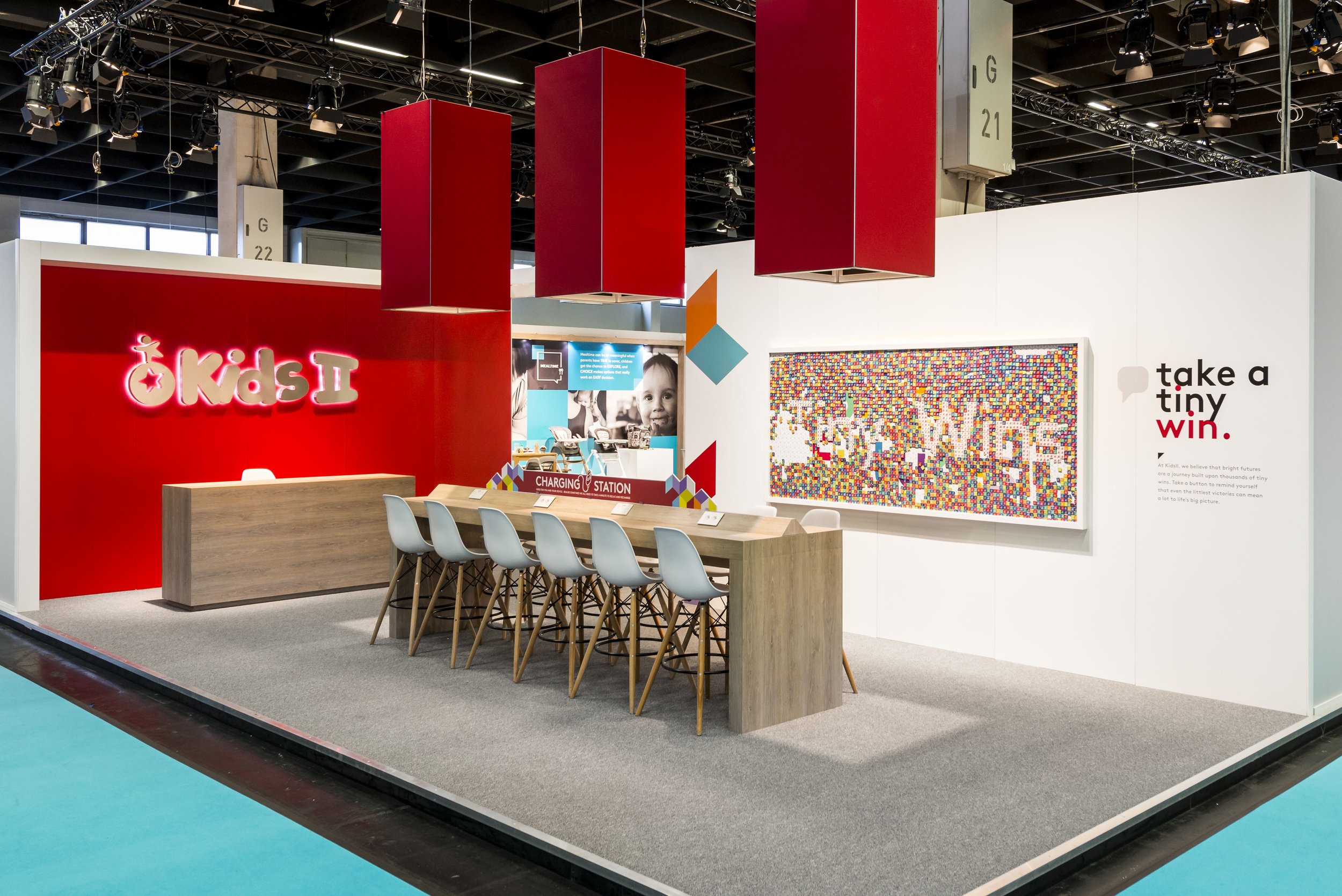
The booth featured a vibrant color palette with joyful, multicolored squares and cubes. Inside, the space was divided into four distinct color-coded zones, each showcasing a product category. Design elements included 3D hanging signage, black-and-white photography, and bold wall graphics. Each zone was styled to resemble a room in a home, helping the products feel relatable and real in their intended environments.
Kids 2 Tradeshow Booth Art Installation
Project Overview:
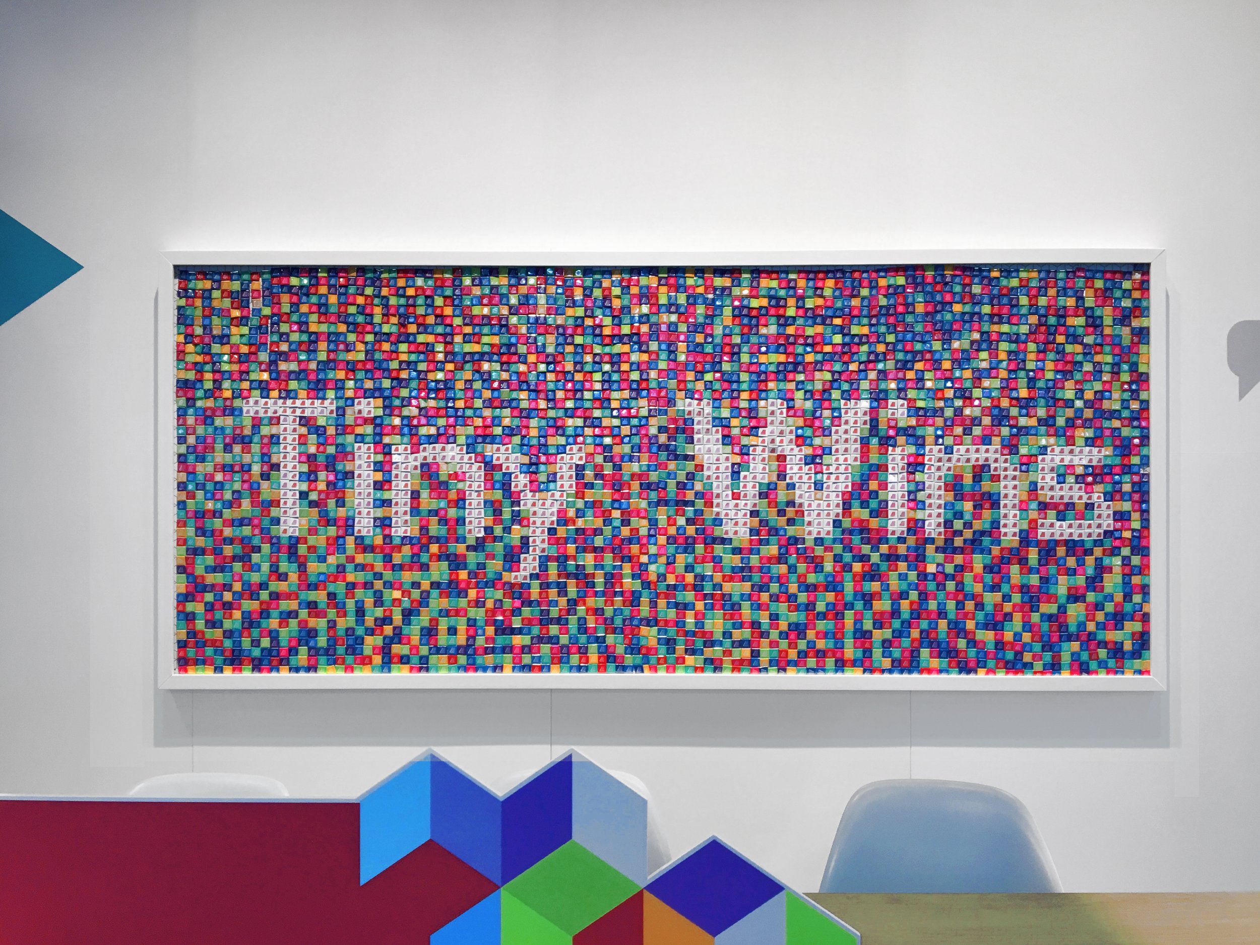
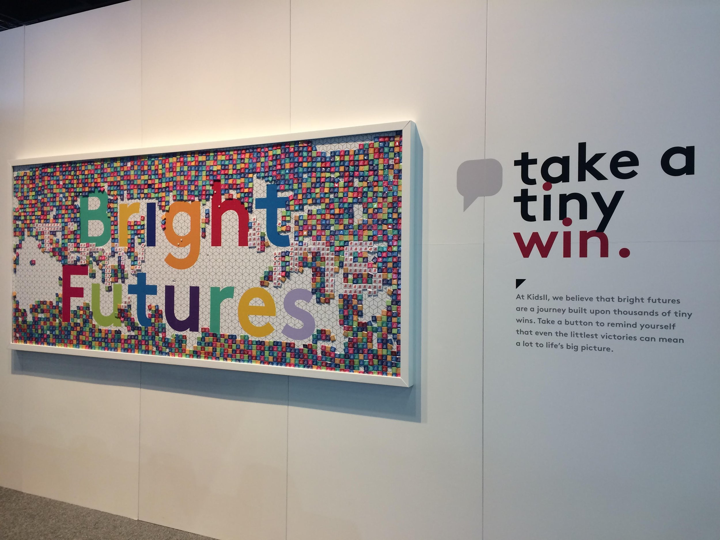
Design an interactive art piece for the outside of the tradeshow booth that engages attendees and promotes the company’s new tagline.
Project Deliverables:
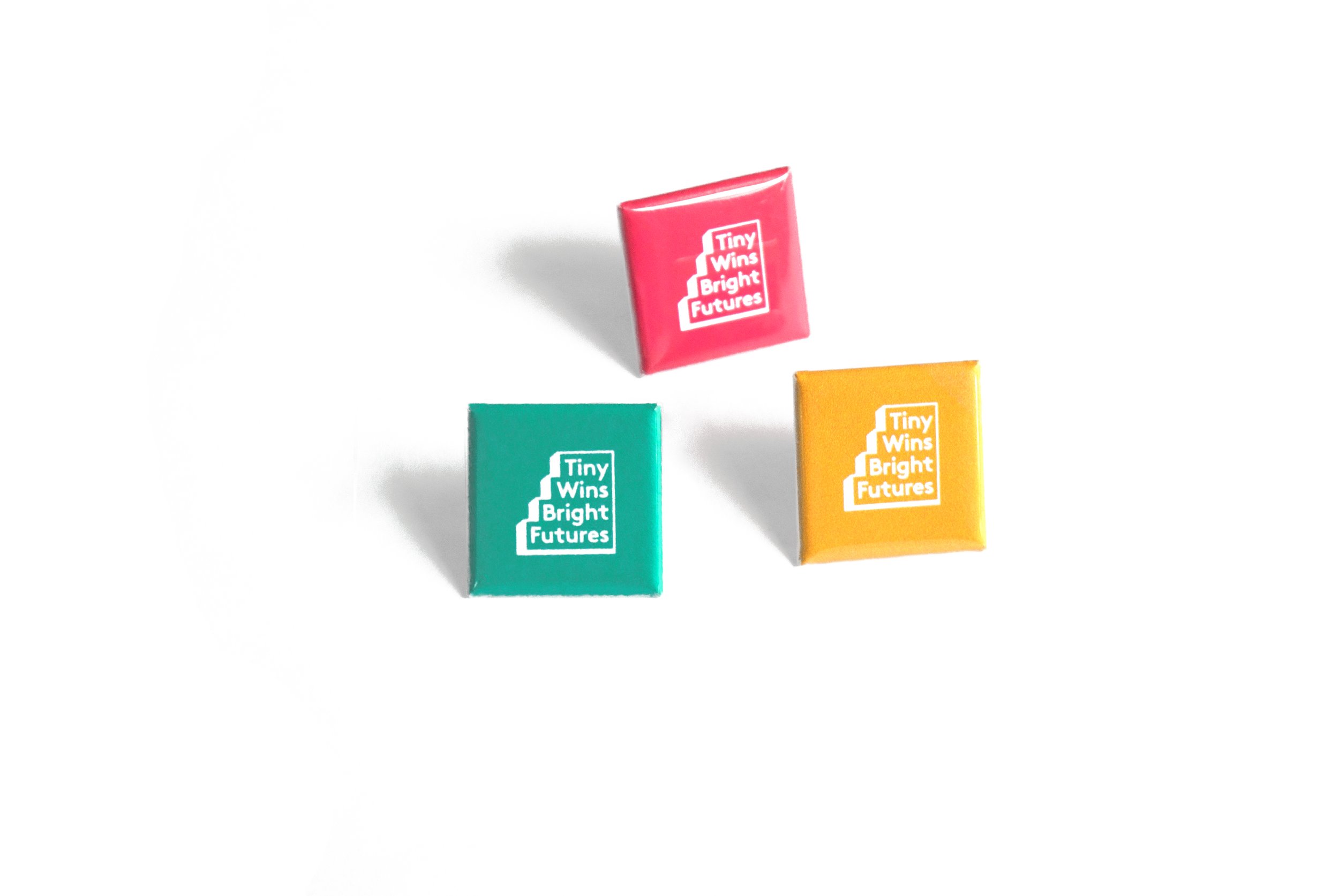
A large framed poster made from hundreds of colorful 1” square pin-back buttons. Initially displaying the message “Tiny Wins,” the poster gradually revealed the hidden message “Bright Futures” over the 3-day event as attendees removed buttons to take home.
Kids 2 Trend Forecasting Publication
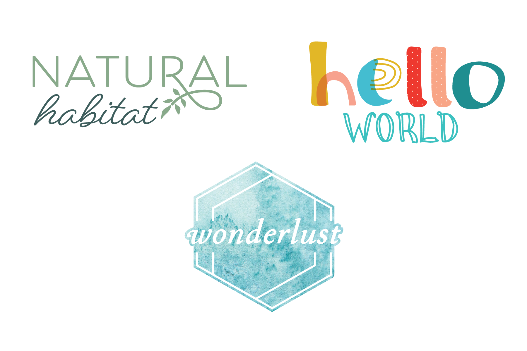
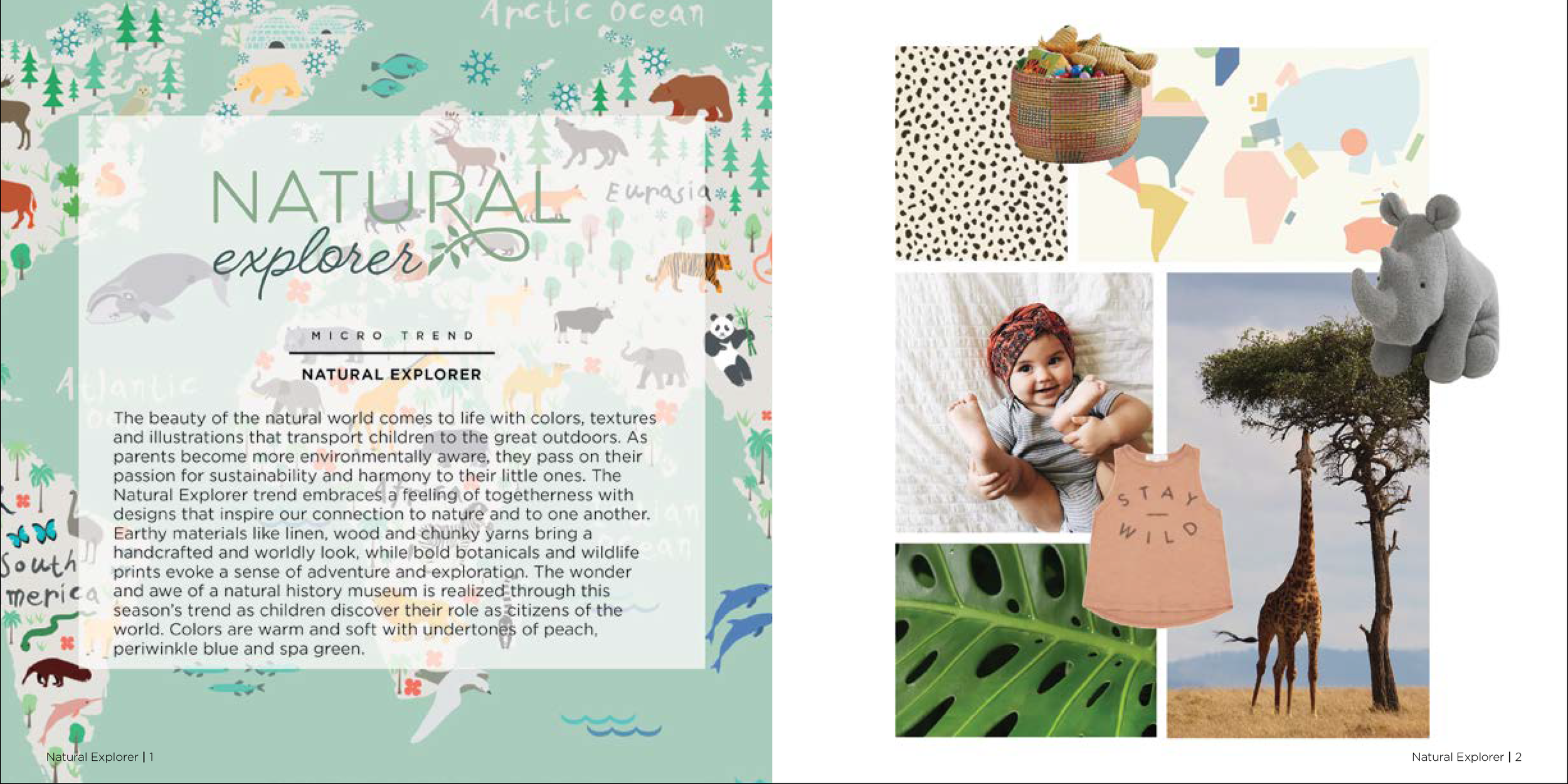
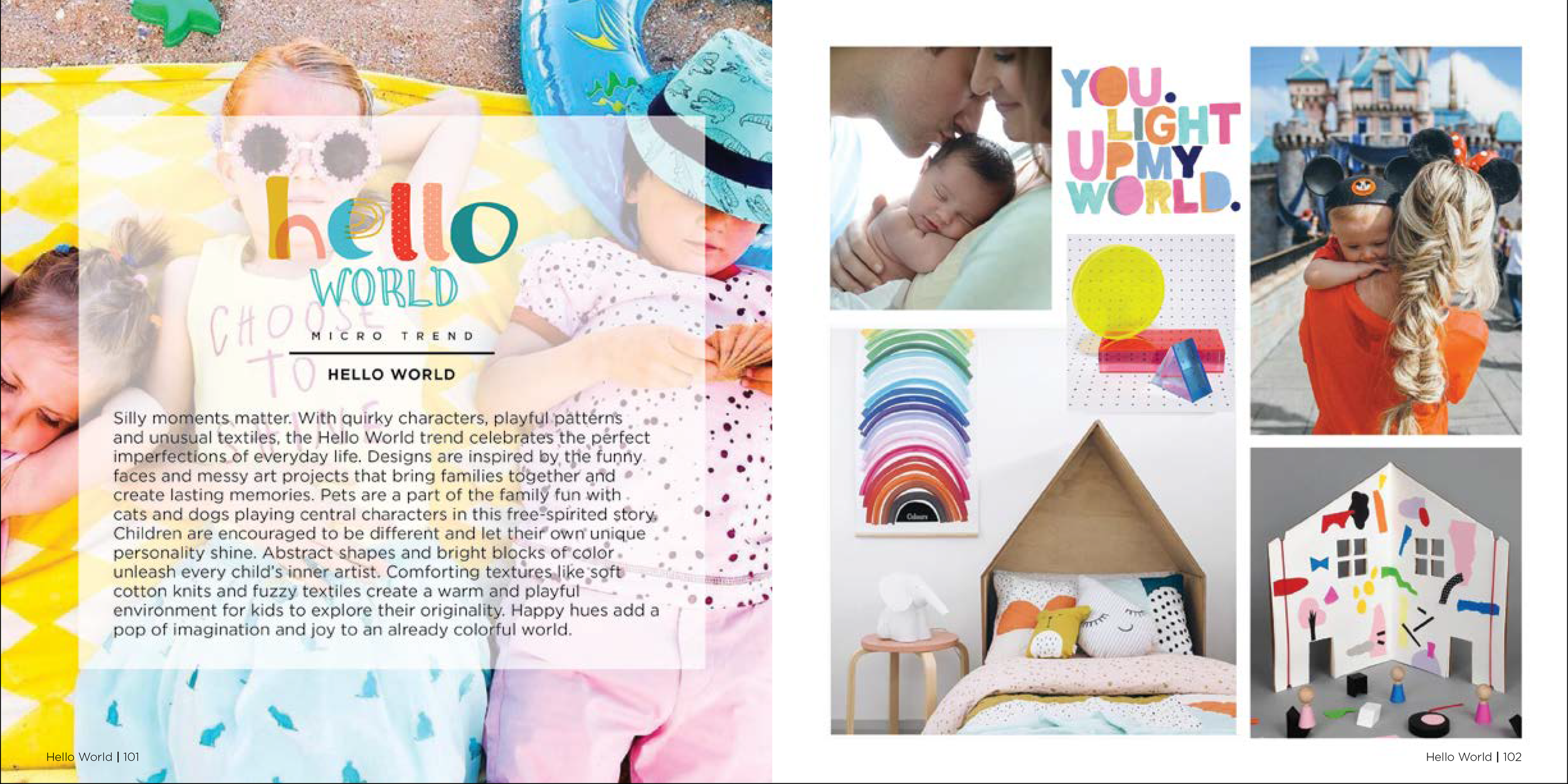
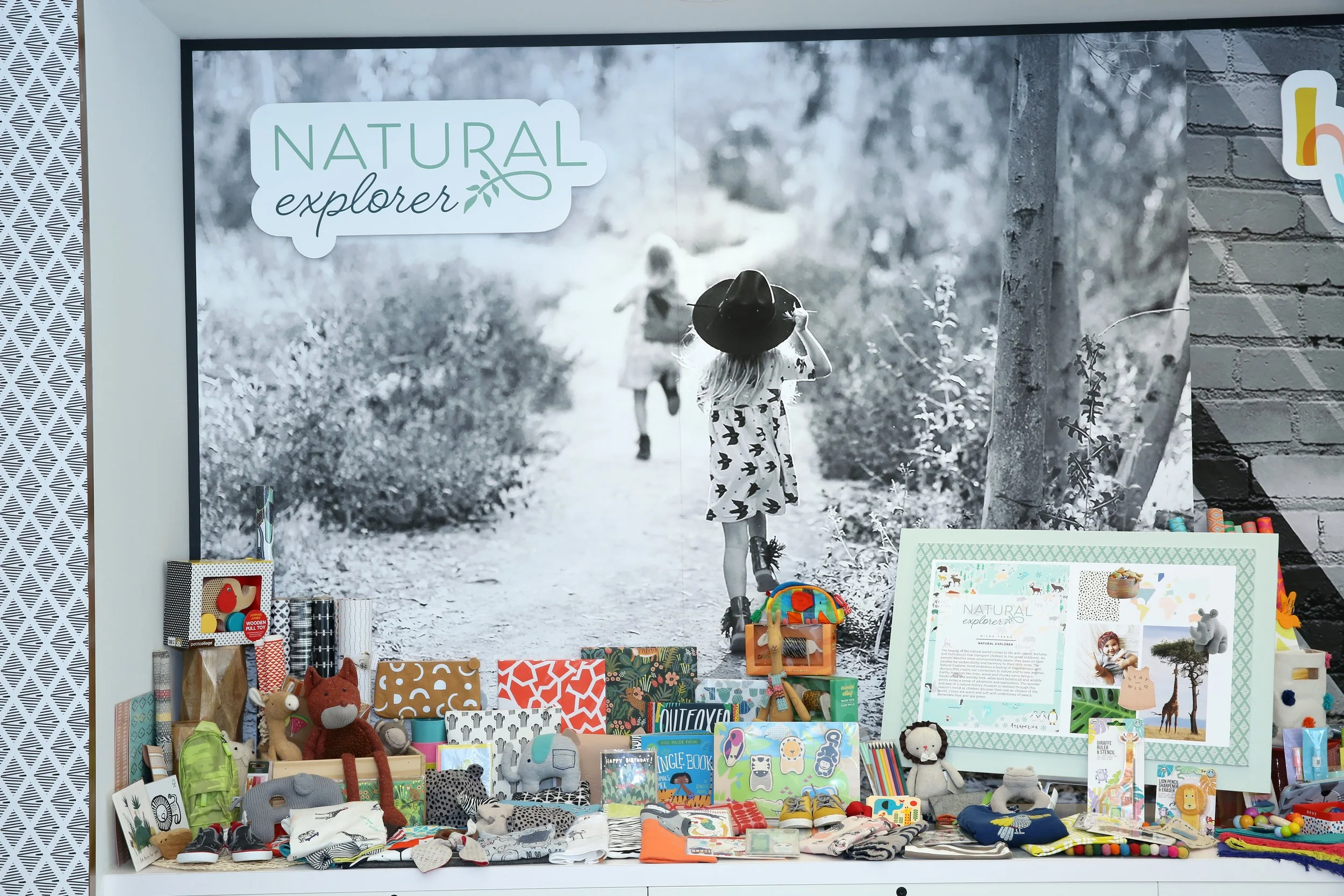
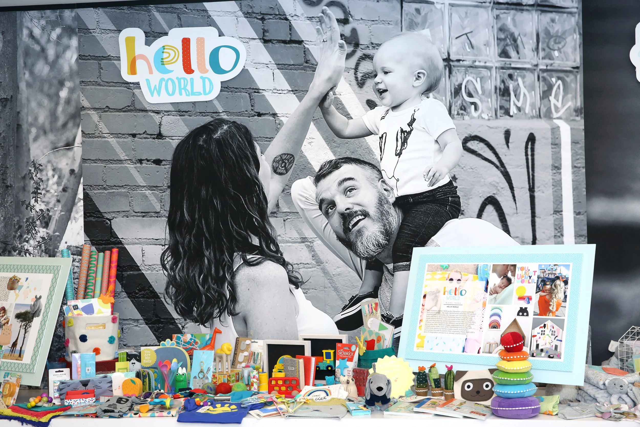
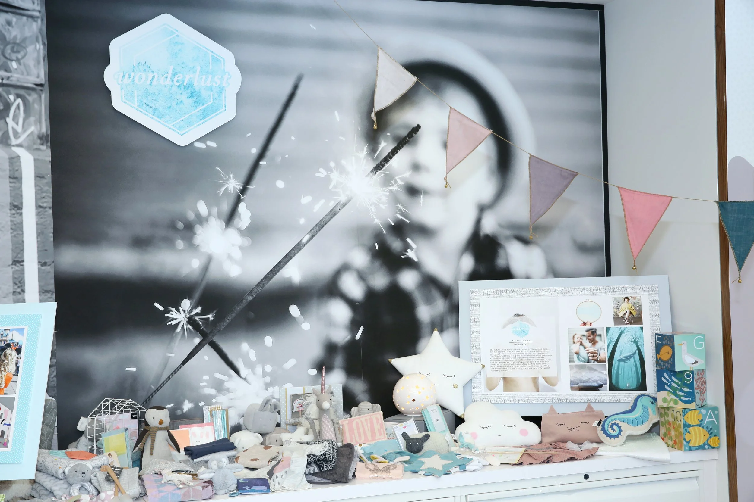
Project overview: Create 3 logos for each of the new seasonal trend themes. The team created product and toy samples around each theme that were displayed around the office. A companion publication was designed that included an in-depth view of each trend by materials, color, patterns and characters for each brand.

Edward Andrews Homes Rebrand
Project Overview:
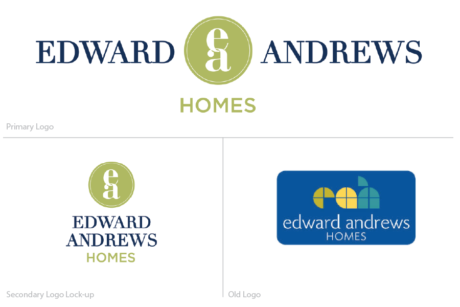
Develop a modern, timeless logo and a distinctive color palette to help a custom home builder stand out in the Atlanta, GA market.
Project Deliverables:
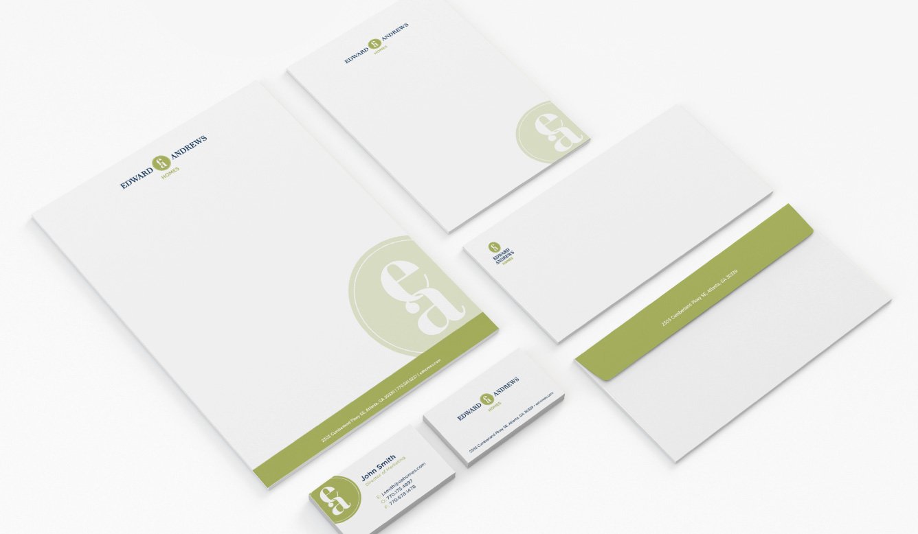
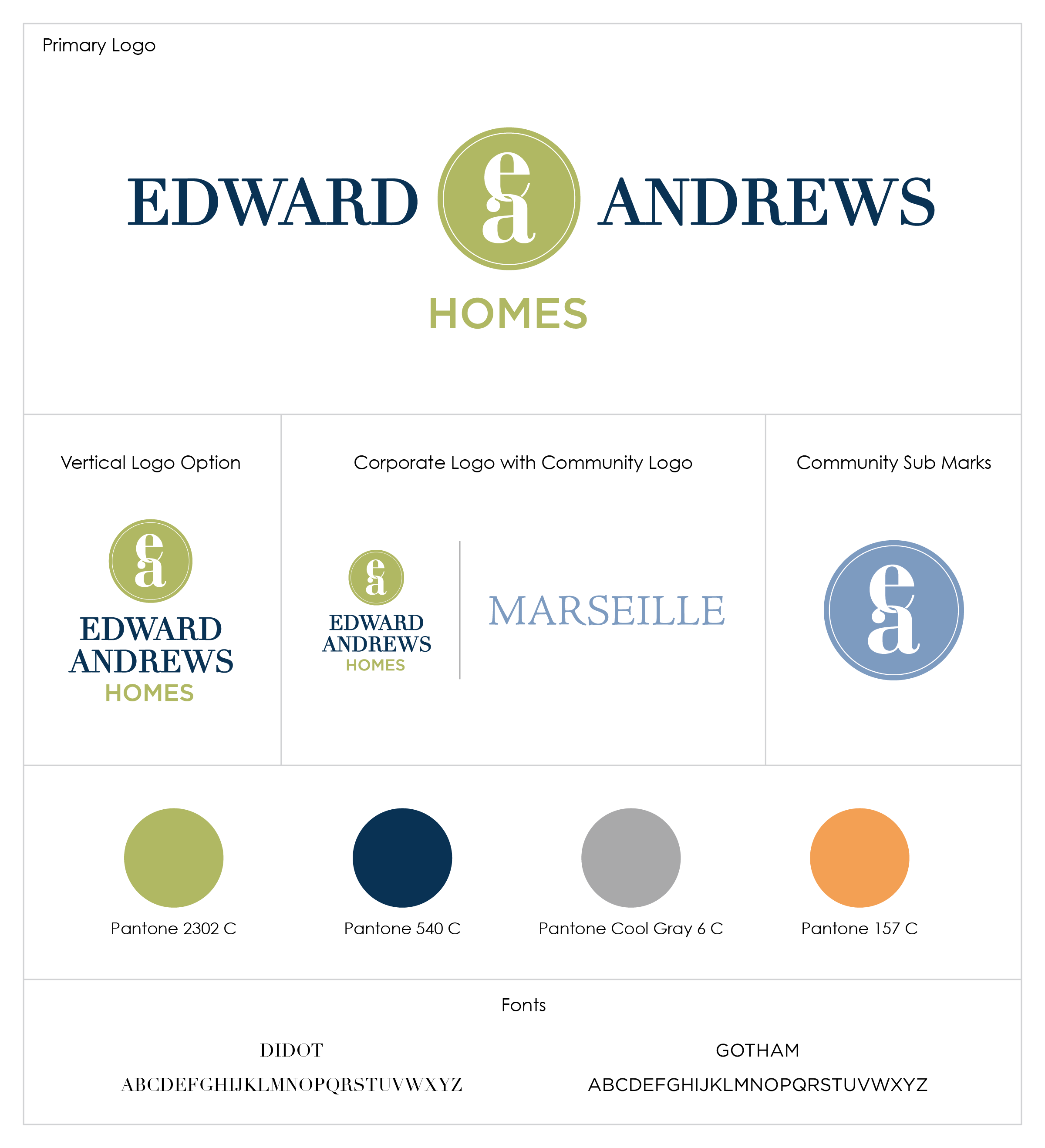
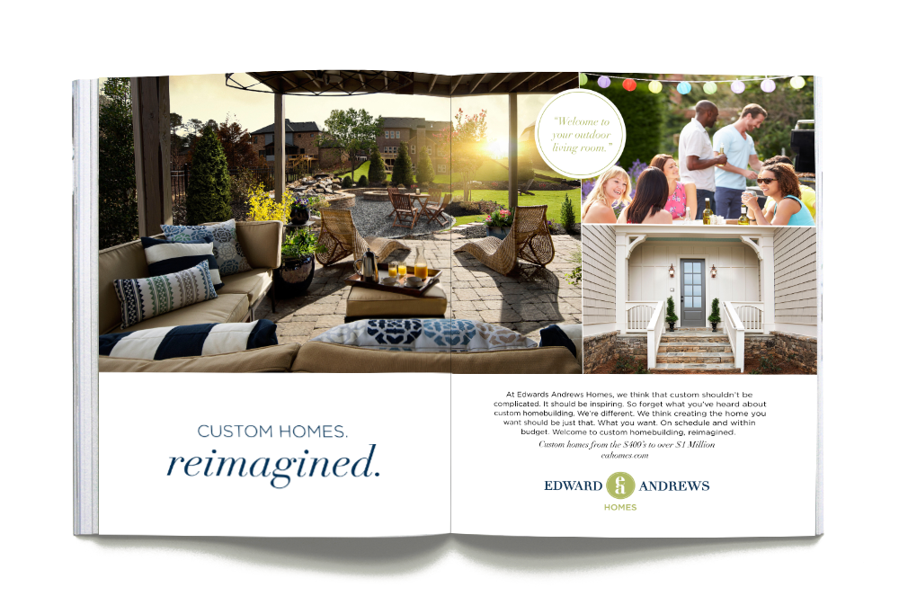
Primary and secondary logo designs, corporate color palette, brand fonts, and a brand guide. Supporting materials included business cards, corporate stationery, and a print/digital ad campaign.
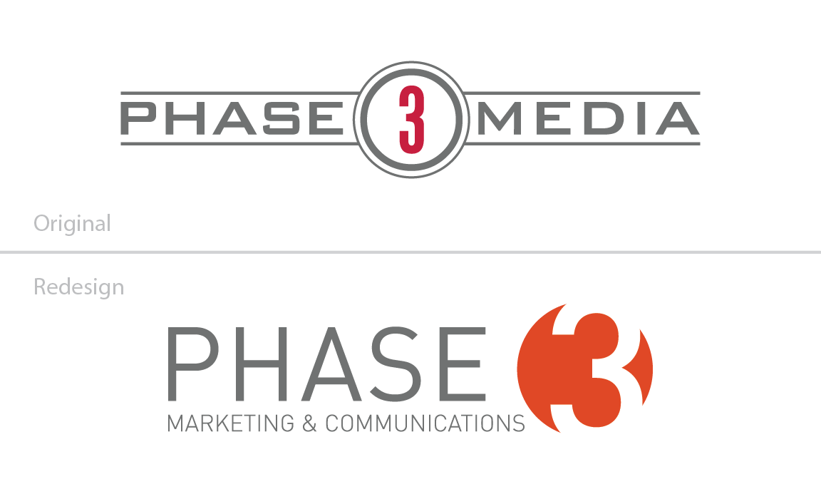
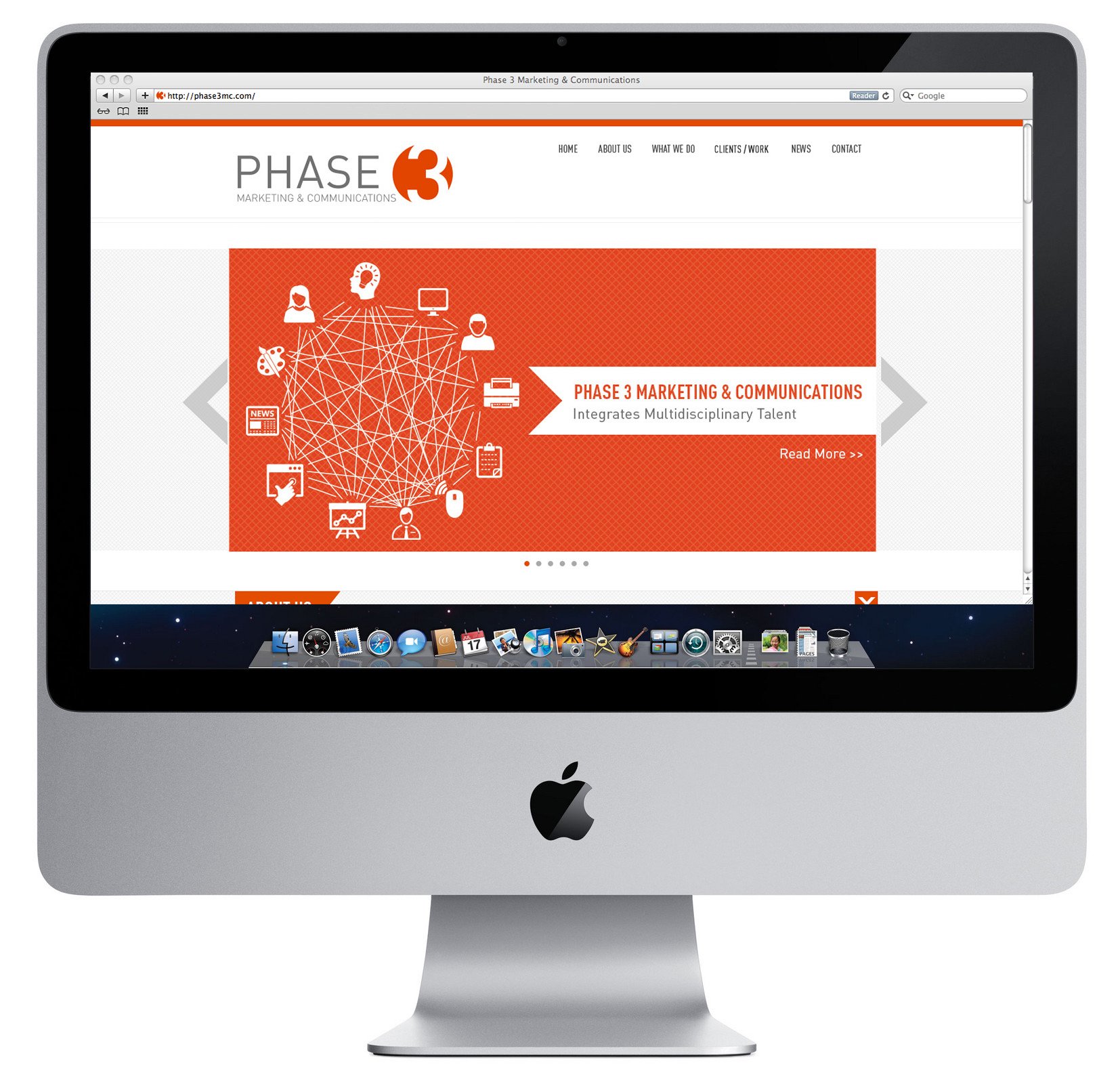
Phase 3 Marketing & Communications Rebrand
Project Overview:
Design a new logo for Phase 3 Media following a company acquisition and name change.
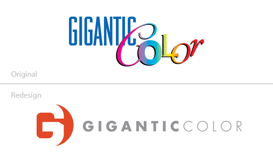
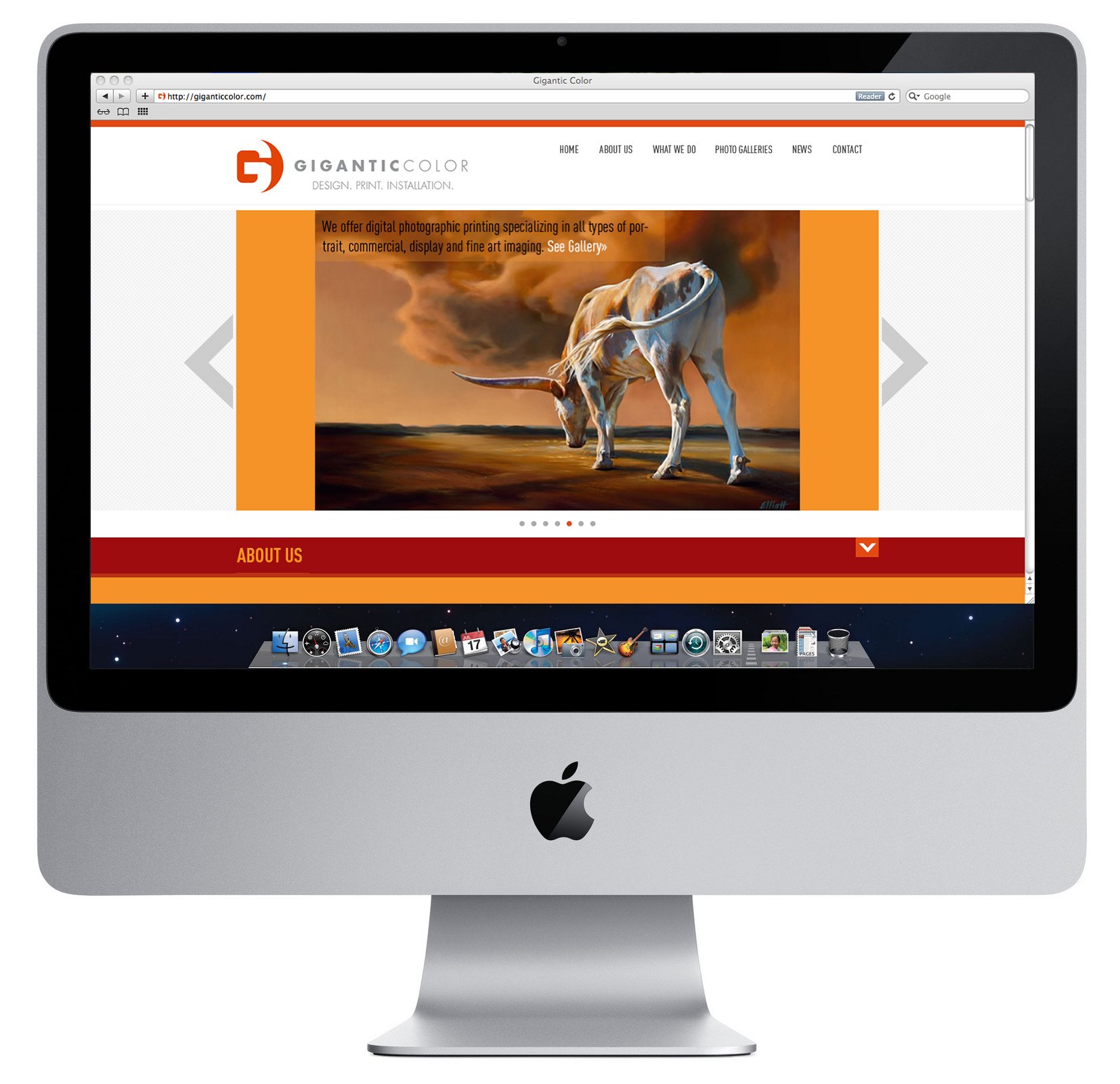
Update the sister company’s logo to align with the new parent brand.
Project Deliverables:
Primary logo design and refreshed brand red for both the parent and sister companies.
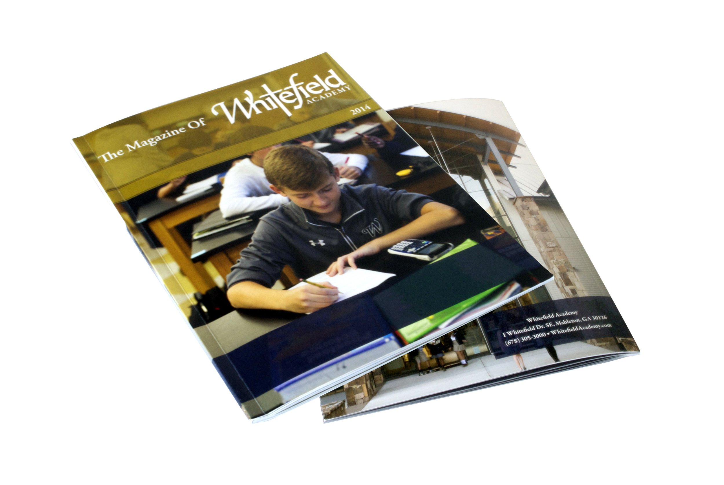
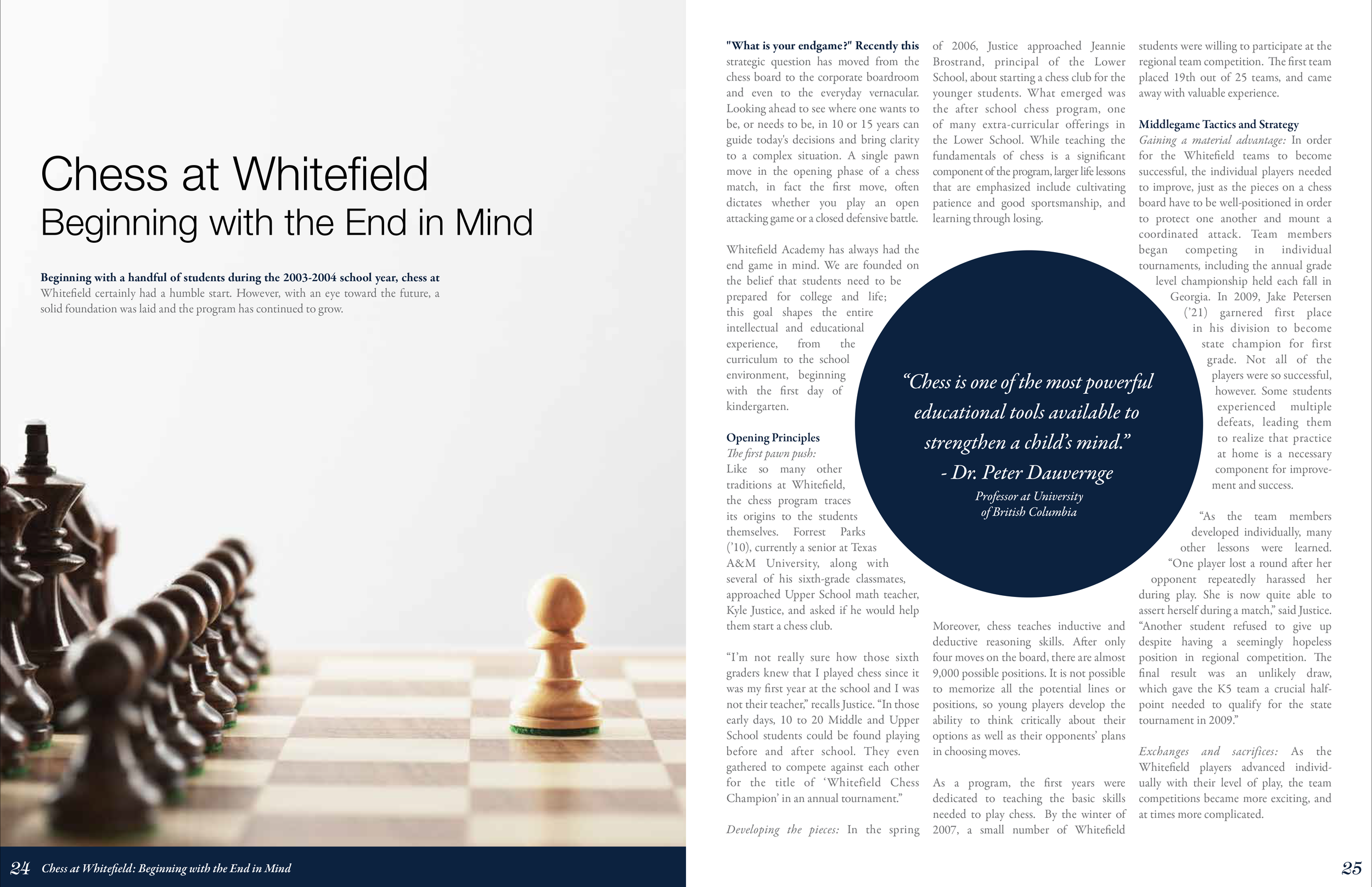
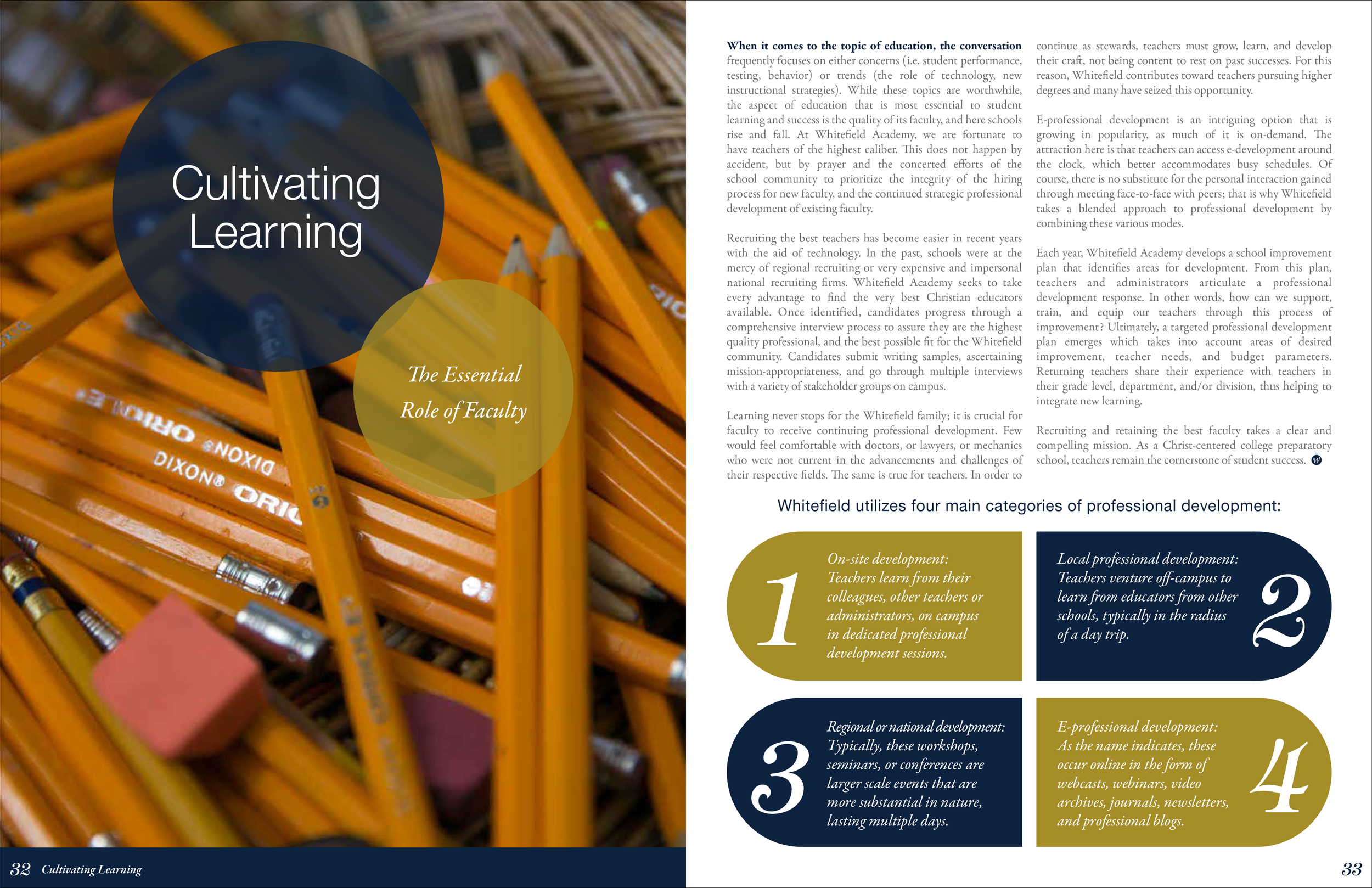
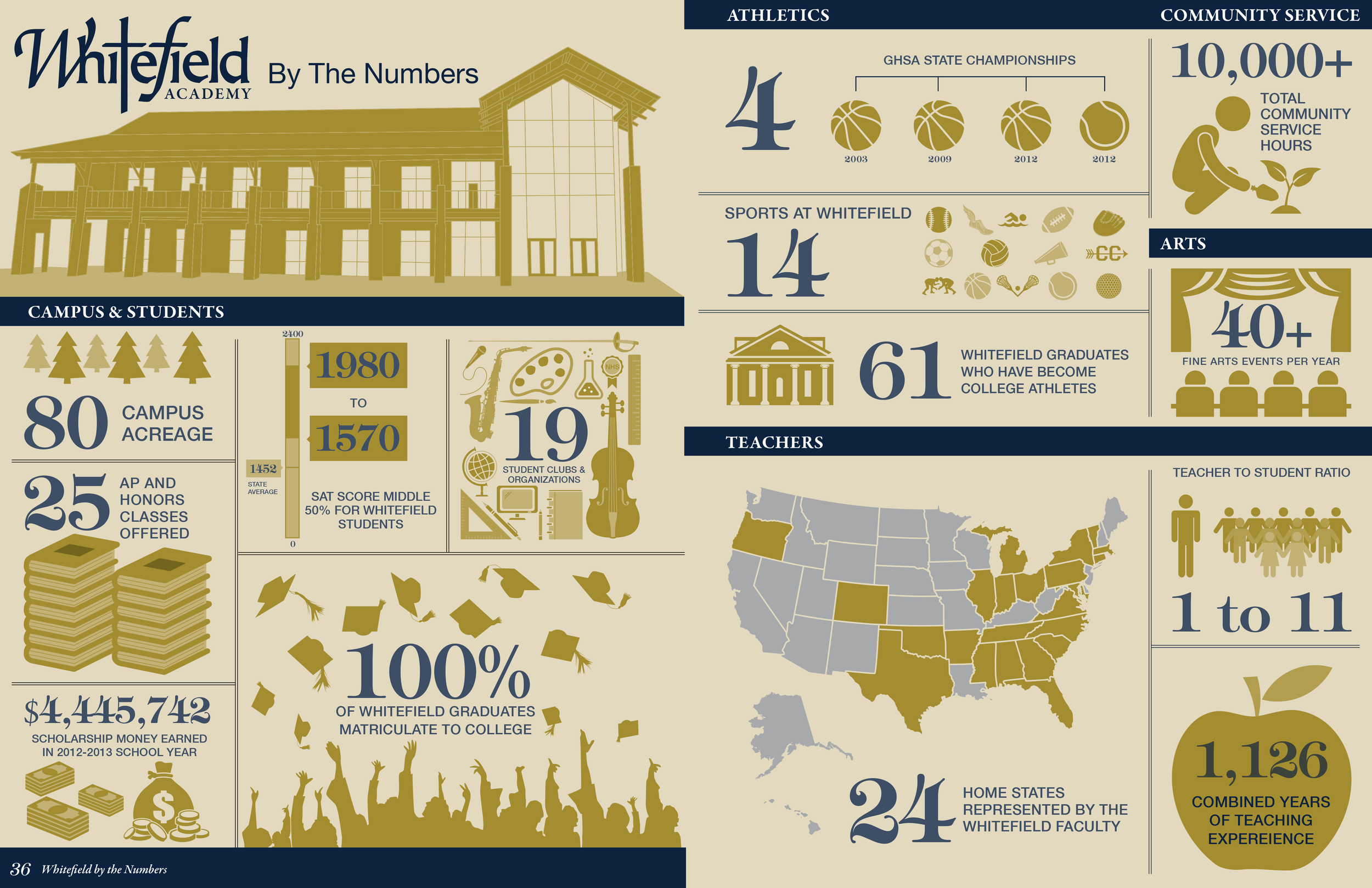
The Whitefield Academy Magazine
Project Deliverables: Design a 60-page magazine that showcases the events and news from the academic year, including an infographic highlighting unique facts about the school, student programs and awards.